Ben Schumin Photography Portfolio
Ben Schumin is a professional photographer who captures the intricacies of daily life.

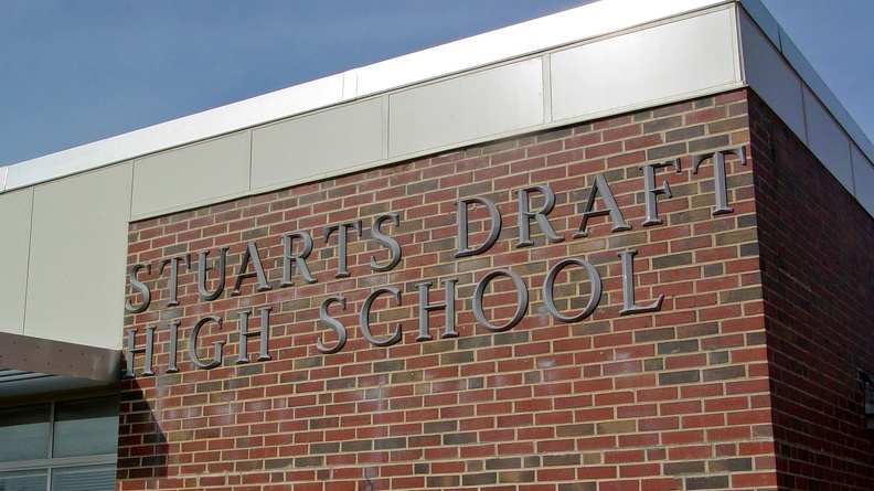
New sign lettering on the front of Stuarts Draft High School, following a renovation to the school that was completed in the mid 2000s. I have never liked this version of the lettering, as I feel that it's too dark for the surface that it's mounted on. The previous lettering that existed prior to the renovation, while using a very dated font, was white in color, and stood out very well against the red brick.
Information
Powered by Piwigo